Psychology of color
It is worth talking about the meaning of colors in psychology. The facts are well known how marketers use colors to increase store sales, how stylists select not only the clothes themselves, but also their shade for a person in order to attract the attention of others. These and other phenomena are studied by color psychology. The definition of colors in psychology and their influence on a person occurs primarily due to their effect on her mood and emotions. For example, when a person looks at dark blue, the number of beats of his heart per minute decreases and his breathing slows down. From this we can conclude: dark blue is a calming color, it gives peace and tranquility. Orange, on the contrary, increases blood pressure, speeds up the heartbeat, and gives a person some stimulation. Of course, colors act on the nervous system, on which all human life depends.
Visual perception of color
A person’s constant predilection for one shade or another is explained by his character. A person has always liked red, but suddenly he buys a gray item, regardless of the meaning of the colors of the clothes. In psychology, this phenomenon is explained simply: he’s used to red and wears it all the time, but he bought gray because at that moment his mood told him, a certain surge. It turns out that with the help of color, you can change your mood. Those who have had a bad look lately tend to look at darker shades. The choice happens intuitively. If the mood is high, then a person needs bright colors.
Luscher color test
Max Lüscher is a professor and psychologist from Switzerland. He devoted his scientific activity to studying the provisions of color diagnostics. It was he who came up with the test named after him, built on the basis of functional psychology. So what is the meaning of color in psychology according to Luscher? First of all, the professor emphasized that the structure of color, and therefore its meaning, remains unchanged. This means that whether a person likes dark blue or not, it still means “peace.” Luscher decided to consider the very attitude of people to the color scheme. And if each person sees it in his own way, then perhaps the meaning of colors in psychology also varies.
Psychology of gray
Gray is a sign of neutrality, middle ground. The person who chooses it for himself does not take into account the meaning of colors in human psychology. She wants to stay away from everything outside. Such people prefer not to open up to others; they keep everything to themselves. This does not mean that they are tense or relaxed, they are simply in the middle, in neutral territory. This is the desire to isolate yourself from everything, to remain untouched.
Those people for whom gray comes last consider it very boring and monotonous. They prefer to enjoy life and enjoy bright colors. This is in some way connected with an irresistible desire to be constantly involved in some kind of activity.
Lusher color value. Meaning
The meaning of the key colors of the test can be determined using the psychological interpretation of colors: they correspond to personality traits. The meaning of the main colors of the Luscher test:
- Grey. A neutral color from a psychological point of view. It characterizes a person who seeks to hide, distance himself from others and limit his territory. Gray does not correspond to either bad or good character traits, but emphasizes reluctance to participate in the diagnosis. By choosing gray, a person can demonstrate his fatigue and apathy. Anyone who puts him in last place is often hyper-emotional and has inflated demands on himself and others.
- Blue. It symbolizes peace and contentment. This color is liked by people who are completely satisfied with their lives, do not experience stress, and easily find a common language with others. If blue is in last place, the person needs acceptance and a feeling of affection. He avoids communication with colleagues, constantly strives for new sensations, but does not receive satisfaction from them.
- Green. Those who choose green put health, willpower and self-affirmation first. Such people tend to consider any phenomenon from a logical perspective. They rely on their memory and analytical skills. Green in the last position means lack of faith in one’s own strengths, refusal of responsibility for one’s actions.
- Red. The color of vitality chosen by leaders. They strive to enjoy all aspects of life. They often have a wide circle of friends, but do not get close to people. Prone to manipulation and selfishness. Red in the last position speaks of a passive attitude towards life and a tendency to submit.
- Yellow. Choosing yellow in the first place speaks of a positive attitude towards life, calmness and love of change. Such people are friendly to others and are not prone to conflicts. They do not like tension and emotional unrest. Yellow in last place is an indicator of disappointment. A person feels isolated, deceived in his hopes. Therefore, he subconsciously avoids surprises so as not to receive new disappointments.
- Violet. This color forms a combination of red and blue - colors with opposite qualities. It is chosen by people with magical thinking, who tend to fantasize and dream of an ideal relationship. Teenagers often put purple first. Neglect of this color speaks of isolation and alienation, a rationalistic approach.
- Brown. People who need physical comfort tend to choose it. They value comfort and often need rest and a cozy home environment. If brown comes last, the person is rejecting his need for comfort. This can lead to loss of the capacity for pleasure and destructive compensation.
- Black. The color of complete negation. It is chosen by people who crave changes in their lives and refuse to put up with the reality around them. If black is in last place, the person is satisfied with living conditions or is afraid of change.
Psychology of blue
Blue color has always symbolized peace and harmony. Scientists have proven that when a person looks at objects made in blue tones, he calms down. At this time, his body prepares for rest and relaxation. This shade carries a harmonious state and symbolizes unity with the world. The meaning of colors in psychology, especially blue, dark blue, indigo, cyan, contains associations with silence and peace.
Blue matches calm waters, a phlegmatic person, femininity, and tenderness. Many scientists believe that it has material completeness. Obese people most often give their preference to this particular shade. If during the test a person rejects the color blue, it means that he is running away from peace and trust, his need for this remains unsatisfied. This may indicate that he does not want to become attached to something and cannot afford to waste time on this, since, in his opinion, such an act entails giving up something very important. Relaxation can lead to depression, which many people try to stay away from. Usually they are constantly tense, and are in search of external stimuli, doing everything to ensure that a state of peace never occurs, because this can lead to a lifestyle devoid of meaning.
How do colors affect the psyche of children?
The environment surrounding the child is an important factor. When decorating the interior of a nursery, you need to take into account various aspects. And the choice of colors that will prevail in the children's room is one of the most important aspects.
How can color affect the development of a baby and the formation of his character? How to use color to help a child fight difficulties or, conversely, distract from negative situations? Experiment with the design of the nursery, not forgetting that the child’s worldview may not coincide with yours. Monitor his mood and condition and act based on this, writes News.nado.ua.
White room: energy of life
For many peoples, white is a symbol of good luck, goodness, and life. According to some beliefs, if you paint the walls of a house white from the inside, then there will be peace in it, and if the doorposts are painted, every person entering the house will leave his evil outside. White has the potential to be a great healing color as it carries hope, energy and the power of transformation. It effectively tones the body and also has a beneficial effect on withdrawn and constrained children, their self-esteem increases. However, dominant white can cause a feeling of inaccessibility and superiority over others, as well as the impression of an excessively sterile room. It is best used in combination with other colors.
Gray room: duality of nature
People who prefer gray do not believe that emotions can change anything, and do not believe in the sincerity of their experiences; they believe that feelings should only be shown in certain circumstances (but not now). Hence their constant stiffness, restraint and, consequently, emotional exhaustion. Gray color stabilizes the environment, but it is ambiguous. On the one hand, it has a negative meaning: a person in a gray room feels isolated, separated from others, it seems to him that he has no future, he is sick, no one needs him, he is missing something.
On the other hand, in its positive meaning, gray color corresponds to the confidence that the surroundings are unshakable and the best is ahead. Associated with this duality are the characteristics of the impact of different shades of color on a person.
Light gray calms both the body and the soul - after all, it strives for white. Moreover, it causes a slight feeling of peace, freedom, and ensures a good psychoenergetic state. And dark gray, on the contrary, being a reflection of the struggle of the mind with causeless anxiety, is devoid of internal energy, it presses, “clipping its wings.” Any shade of gray does not encourage action. A dark gray room is not suitable for healthy children, as it is the color of illness, passivity, and boredom.
Yellow room: for the smart and inquisitive
The color yellow represents the mind - it is believed that it influences intellectual development and stimulates the expansion of cognitive interests. It helps to overcome difficulties and promotes concentration (which is why, for example, exams taken in a classroom with yellow walls are most successful). Under the influence of yellow, a person makes decisions quickly. People who prefer this color are characterized by such qualities as high self-esteem, self-confidence, optimism, positive thinking, as well as an active life position and efficiency. Those who reject yellow, as a rule, lack psychological independence.
Yellow color stimulates the development of intuition and intelligence. His presence in the nursery has a positive effect on absolutely all aspects of the child’s life. It is perfect for decorating a baby’s room, as it activates brain activity, elevates mood, increases the speed of perception, and visual acuity. This color is contraindicated only in cases where the child is too excitable or suffers from neuralgia.
Calm or bright?
The word “children’s” is applicable to completely different rooms: for games, for activities, for sleeping. Perhaps, not every person can allocate several rooms for a child - as a rule, children sleep and play in the same one. You should not make the baby’s room too bright and fill it with many colorful toys, likening it to children’s playrooms in entertainment centers. The task of the latter is to distract the child from his parents and stimulate his activity for a short time. Adults calmly wander around the shops, and then discuss purchases in the car when the child falls asleep after outdoor games. In the end, everyone is happy.
At home, such a design will lead to the fact that the child will be constantly excited, will become capricious, demanding new entertainment from tired mom and dad, and will have difficulty putting him to bed. We must not forget that a child’s room is first and foremost a bedroom. It is turned into a playroom with bright toys that can be taken out of drawers and then put away.
Green room: hope is my earthly compass
This room is a place for relaxation. Green is the result of the fusion of blue and yellow, so it combines the qualities of both. Hence - peace and a minimum of movement. It promotes introspection, stimulates a person’s desire to understand himself, does not demand anything and does not call him anywhere. However, this color carries potential energy: it always promises certain life prospects, symbolizes prosperity and new beginnings. Green normalizes blood pressure, stabilizes pulse and breathing, and increases visual acuity. Under its influence, a person becomes more attentive - that’s why in the past, desks were covered with green cloth, and table lamps had green lampshades. In addition, the dominance of green colors in the interior of a nursery promotes a good mood and helps fight insomnia. Drawings, toys and book bindings in green tones are what a child needs.
Please note: pastel colors are ideal for children. It refreshes the room and creates a good mood. You can paint all the walls in different tones. Thus, a bluish or greenish wall on which the sun's rays fall reduces the brightness of the color and causes a feeling of coolness. It is better to make a wall in the shade peach or cream. And to stimulate a child’s creative activity, Japanese designers recommend hanging children’s drawings on the walls. This will give the room an individual style.
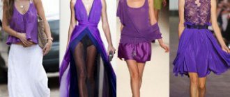
Purple room: excess of feelings
Purple is a heavy color. It must be diluted with “gold”, otherwise it can lead to depression. People who are sentimental, who give themselves too much to their feelings, who are carried away by mysticism, or those who cannot find the strength to realize themselves prefer purple. Individuals who are independent, rational, and able to control their emotions and actions, as a rule, reject it. Purple is not the best color for a child's room, since, according to physiologists, it lowers the pulse, and according to the observations of psychologists, it forces you to concentrate on your feelings and does not contribute to emotional maturation.
Red Room: Movement and Activity
Red is a source of energy, it represents power, breakthrough, and the will to win. This is the color of activity, impulsiveness, activity; it inspires and gives strength. People who prefer it are always on the move and achieve what they want. They love to be first, although they do not always succeed. The motto of this color is: “Let the fittest survive.” Red can also have a destructive effect - like fire, which both warms and burns. It makes you alert to danger. Adherents of this color are characterized by maximalism in emotions: such people passionately love, passionately hate and passionately believe. They are practical, usually do not beat around the bush (they never persuade - they take what they need), although they are prone to spontaneous actions.
Red and burgundy colors have a stimulating effect on the nervous system and increase blood pressure. Hypotonic and apathetic, inactive children will feel better in an interior with bright red accents. But these should be separate elements, and not red wallpaper on four walls. With prolonged exposure, this color negatively affects the child's psyche, so an interior with a predominance of red can cause headaches and nightmares. Children living in such a room quarrel more often.
When decorating a nursery, you need to take into account the age of the child. When he is less than 2 years old, the main role is played by the tastes of his mother, through whom the child perceives the world. If you decorate the room in such a way that the mother begins to feel discomfort (even if it is soothing blue or development-stimulating yellow), then her son or daughter will also feel uncomfortable. For general development in the nursery, it is useful to have toys of all primary colors so that the baby can learn their names. A 3-7 year old child forms his or her understanding of the world through play. Therefore, the room must be designed so that it can turn into a play space. When the baby wants to sleep, toys should be put away in drawers and cabinets. It is better to use several colors in a preschooler’s room: this helps to master color standards and contributes to the emergence of various emotional states. You also need a place for self-expression - a corner for drawing on the wall or for designing. At the age of 7-12 years, the leading activity is cognitive. A study room should not be covered with wallpaper with bright, detailed patterns, as they are distracting and interfere with concentration.
Orange room: warm sun
This warm, joyful and energetic color has all the advantages of red, but does not carry aggression and is quite gentle. The vitality of red allows orange to displace all other colors. It constantly keeps you on your toes and is associated with self-affirmation and the desire to achieve a goal. Orange is warmth, bliss, intensity, but at the same time, the muted light of the setting sun. Almost always it has a beneficial effect, as it improves mood, evoking thoughts about the positive aspects of life (unlike blue). This color helps a person feel more relaxed and free, and encourages optimism and openness in communication.
According to researchers of children's psyche, all kids love orange. It promotes digestion and increases appetite, but too much of this color in the interior can cause overwork in a child, and sometimes even dizziness. Therefore, it is best if only a few details in the nursery are orange. Orange has an energizing effect on withdrawn children and helps free them from fears. It stimulates the development of creative abilities.
Pink Room: Dream World
Pink speaks of romance, kindness, love, passion. The warmth of this color dissolves negativity. It creates a feeling of comfort, calms, relieves obsessive thoughts and gloomy moods, and helps overcome crisis conditions. Pink is often chosen by overly sensitive people. The predominant pink indicates a person’s need for protection, his detachment from real life, his retreat into the world of dreams, fairy tales and sublime thoughts. Excessive passion for this color indicates that the teenager considers himself too subtle, emotional, aristocratic in nature, who finds it difficult to fit into the rough world around him. If you want to raise your child to be a leader, domineering and tough, this color will not be suitable for his room.
Blue Room: Bottomless Pool
This color “has no bottom” - it is endless, draws you into itself. However, its strength is underestimated. It creates the preconditions for deep reflection on life situations and calls for a search for meaning and truth. At the same time, blue indirectly drives melancholy when a person does not receive an answer to the questions that torment him. Adherents of blue are distinguished by constancy, perseverance, dedication, and rigor. They try to put everything in order, systematize, always have their own point of view, if they do something, they do it selflessly, and their devotion to others can reach the point of voluntary slavery.
Blue depresses the nervous system, causes a weakening of the pulse, relieves muscle tension and dulls pain. Sometimes fatigue and depression occur under its influence. In a nursery, this color can be present only to a very limited extent: for example, pajamas, a child’s robe, a border on a blanket.
Black Room: Mysterious Inner World
Black hides everything, it attracts and frightens, it is mysterious, but at the same time rich and ambiguous. Black always challenges people, and under its influence they release their essence. A person must go through black in order to know how much white there is in him. The tense atmosphere of a black room cannot be called beneficial for the successful emotional development of a child. Black implies the negation of other colors. And if a teenager introduces it into the palette of his interior, this most likely indicates an active rejection, for example, of the life values of his parents, or their relationships, or the world of adults in general. The black color in a student’s room can indicate that he is building his own model of the world - quite aggressive, or a pessimistic, inactive period of life.
Psychology of green
The effect of the color green is also considered an important component in the interpretation of the concept of “the meaning of colors.” In psychology, it is believed that people whose spiritual attachment is dissatisfied try to compensate with this particular paint. It symbolizes independence. Sympathy for her is often found among young people who want to quickly become independent. It is a symbol of constancy and perseverance, a certain degree of cruelty, firmness and perseverance. People who choose green are very wary of change. They strive to increase self-confidence in their skills and abilities through self-affirmation. They can gain sympathy from others, for example, due to their financial status.
This shade controls a person to some extent. A person may feel pride, superiority over others, and a desire to control other members of society. Green lovers tend to think a lot about health and how to increase their life expectancy. They defend their principles, sometimes suffering from the fact that they do not receive recognition from other people. As for those for whom green is in last place, we can say that they have lost the strength to fight. This may lead them to blame others for their mistakes. Those who reject the color green are people who have lost self-control and patience, resulting in impulsive behavior.
Green color in the drawings of a preschool child: meaning in psychology
Green is the color of grass and trees. Children love to draw flowers, leaves and grass. But, if you notice that your baby often draws such pictures, then perhaps he feels a lack of love on your part. Going into the fabulous world of plants, he fills the vacuum of warmth and parental care.
Children's drawing about summer
Children who draw plants are sensitive to injustice towards them. They, like a barometer, react to an unfavorable microclimate in the family. They are vulnerable and shy.
What does the color green mean in children's drawings?
Psychology of red
People who want to experience sexual intoxication choose red or its shade of crimson. The significance in psychology shows that they are primarily looked at by individuals who crave exciting experiences and emotions. Shades of red symbolize vitality. They increase blood pressure and improve appetite. People who love red want to experience the fullness of life. Those who put it first are involved in sports and wrestling. This is the color of masculinity, aspiration, fire, spiritual strength, conquest. Also means sexual desire. People who have red in last place feel threatened by it because they lack vitality. They most often choose blue as a compensating color to enhance calmness. At the same time, attachment to him becomes painful due to failures in love.
Purple color in the drawings of a preschool child: meaning in psychology
Psychologists believe that the color purple can evoke sadness and sadness. It is rarely chosen for interior decoration, clothing and furniture. Should you be upset if you notice that your child is constantly drawing with a purple pencil? The color purple comes in many shades and some shades are as vibrant as red or yellow.
All shades of purple
You can’t do without purple if you need to paint an autumn sky or a stormy sea. Some flowers have purple petals, and if your child uses purple pencils for such drawings, nothing bad will happen to him.
Spring landscape. The forest is painted with purple colors
Psychology of yellow
Often the rejection of blue causes a person to choose yellow. The meaning in psychology is associated with a burdening attachment that requires relief in order to eliminate depression. Unsatisfied emotionality forces a person to continually look for a way out of the situation. It is a search for satisfaction and harmony, an attempt to find the meaning of life and a place where you can use your capabilities to the maximum. Yellow color is the brightest, liveliest and lightest. Associated with stimulation. The pulse and breathing increase, just like with red.
The main advantage of yellow is its brightness and unconscious positivity. It indicates a person’s desire to free himself from heaviness, from something that oppresses him. People for whom this color comes first hope for happiness and expect it in all forms and manifestations. They want to achieve recognition and respect. Well, those who put yellow as last, as a rule, are disappointed in life, in hopes, in people. They stand face to face with emptiness. Due to the brightness inherent in yellow, it can be rejected due to overexcitation, as a result of which a person feels irritable, angry, distrustful of people, and is constantly in a bad mood.
Black color in the drawings of a preschool child: meaning in psychology (give a link to the article)
Black is the saddest of all possible colors. Should you panic if your children's drawings are black and white? Sometimes children choose this style of drawing only because it is easier and easier to convey the shape of drawn objects, animals and people. Only those drawings in which there is expressed aggression or resentment towards the world around us should be wary. Psychologists believe that this color can be chosen by a child in a depressed emotional state.
Sad child's drawing
In such cases, parents need to try to understand the reasons for their children's depressed mood. Sometimes, with their drawings, children themselves give clues to their parents.
Drawing calling for help
If children draw scary, from the parents’ point of view, pictures with a black pencil, the parents have a question: is everything okay with the baby’s health? Before turning to psychotherapists for help, determine whether your child sees your fear and confusion when you look at these pictures? The fact is that children can read your inner feelings by the expression on your face. And if the baby liked your scare, he may deliberately continue to draw such pictures in order to scare his parents.
Black and white children's drawings
Usually, parents turn to the help of psychotherapists when they themselves feel helpless in solving problems with raising their child. Thus, they shift their work of raising children onto the shoulders of other people.
VIDEO: Psychologist’s work in kindergarten
How to determine a child’s emotional mood at home?
Ask your child to draw an elephant. If a child draws it with a black and gray pencil, it means he is in a sad mood today.
Gray elephant
If the elephant turns out to be multi-colored, the baby is cheerful and can make gray everyday life festive in his imagination.
Multicolored elephant
But, even at preschool age, some children are able to think logically and build logical chains. And they could be like this:
- The elephant in the picture and in the zoo is gray.
- If you draw an elephant in a different color, it will no longer be an elephant.
- This means you need to draw the elephant with a black and gray pencil.
As a result, the elephant in the picture will be gray regardless of the child’s mood. The pictures drawn by the baby reflect his inner world. If your baby loves to draw bright, interesting landscapes, still lifes or portraits, this speaks of his rich inner world. And it doesn’t matter what paints or pencils he chose for this purpose. You can read more about the meaning of black in children’s drawings in this article.
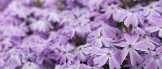
Psychology of purple
People choosing a color scheme may not appreciate the meaning of lilac. In psychology, it indicates a person’s increased emotionality, as a result of which he can anticipate some actions or events. Purple is a mixture of red and blue, unbridled energy and calmness. Two opposing forces. The color violet is responsible for the love of magic and the desire to possess it. The meaning in psychology is explained, on the one hand, by a person’s dreams of sensual merging with a partner, and on the other hand, by isolation, because there are no prerequisites for this.
Psychology of brown
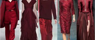
Scientists have long studied the psychology of color. The meaning of color in the clothes chosen by a person very well describes his essence. Brown color is a mixture of yellow and red with shading. All the unbridledness of red in it is muted, suppressed. It is put in first place by people who lack vitality. Everything around them is perceived passively. Brown symbolizes the sensory perception of the world and makes it clear how a person relates to physical sensations. He has an increased need for rest, for creating comfort and peace around himself. If brown is in last place or the color is rejected altogether, the person is seen as an individual trying to distinguish himself from the crowd. As a result, it can cause the attention of obsessive sexual people.
Luscher test - description and interpretation
Library » Methods, Psychology of Color » Luscher Color Test The Luscher
test is based on the assumption that the choice of color often reflects the subject’s focus on a certain activity, mood, functional state and the most stable personality traits.
Foreign psychologists sometimes use the Luscher test for career guidance purposes in personnel selection, staffing production teams, and in ethnic groups; gerontological studies, with recommendations on the choice of marriage partners. The meanings of colors in their psychological interpretation were determined during a comprehensive examination of a large contingent of different subjects.
Characteristics of colors (according to Max Luscher) include 4 primary and 4 additional colors.
Primary colors:
1) blue - symbolizes calmness, contentment;
2) blue-green - a sense of confidence, perseverance, sometimes stubbornness;
3) orange-red - symbolizes willpower, aggressiveness, offensive tendencies, excitement;
4) light yellow - activity, desire to communicate, expansiveness, cheerfulness.
In the absence of conflict, in the optimal state, the primary colors should occupy predominantly the first five positions.
Additional colors: 5) purple; 6) brown, 7) black, zero (0). They symbolize negative tendencies: anxiety, stress, fear, grief. The meaning of these colors (as well as the main ones) is determined to the greatest extent by their relative arrangement and distribution by position, which will be shown below.
Instructions (for a psychologist): “Shuffle the colored cards and place them with the color surface facing up. Ask the subject to choose from eight colors the one he likes best. In this case, it must be explained that he must choose the color as such, without trying to correlate it with his favorite color in clothes, eye color, etc. The test subject must select the most pleasant Color out of eight. The card with the selected color should be set aside, turning the colored side down. Ask to choose the most pleasant one from the remaining seven colors. The selected card should be placed with the colored side down to the right of the first one. Repeat the procedure. Rewrite the card numbers in laid out order. After 2-3 minutes, place the cards again with the color side up and do the same. At the same time, explain that the subject should not remember the order of the layout in the first choice and consciously change the previous order. He should choose colors as if for the first time.
The first choice in the Luscher test characterizes the desired state, the second - the actual one. Depending on the purpose of the study, the results of the appropriate testing can be interpreted.”
As a result of testing, we get eight positions; the first and second are a clear preference (denoted by + +);
third and fourth - preference (denoted x x);
fifth and sixth - indifference to color (denoted = =);
seventh and eighth - antipathy to color (indicated by - -)
Based on an analysis of more than 36,000 research results, M. Luscher gave an approximate description of the selected positions:
The 1st position reflects the means to achieve the goal (for example, the choice of blue indicates the intention to act calmly, without undue tension);
The 2nd position shows the goal that the subject is striving for;
The 3rd and 4th positions characterize the preference for color and reflect the subject’s feeling of the true situation in which he is, or the course of action that the situation suggests to him;
The 5th and 6th positions characterize indifference to color, a neutral attitude towards it. They seem to indicate that the subject does not connect his state, mood, motives with these colors. However, in a certain situation, this position may contain a reserve interpretation of color, for example, blue (the color of peace) is temporarily set aside as inappropriate in this situation;
The 7th and 8th positions characterize a negative attitude towards color, the desire to suppress any need, motive, mood reflected by this color.
| + | + | X | X | = | = | — | — |
| 3 | 4 | 1 | 0 | 2 | 5 | 6 | 7 |
The selected colors are recorded using a list of numbers in order of preference, indicating positions. For example, if you select red, yellow, blue, grey, green, purple, brown and black, you write:
Zones (+ +; x x; = =; — —) form 4 functional groups.
Interpretation of test results
As noted, one of the methods for interpreting the results of a choice is to evaluate the position of the primary colors. If they occupy a position further than the fifth, it means that the properties and needs they characterize are not satisfied, therefore, there is anxiety and a negative state.
The relative position of the primary colors is considered. When, for example, No. 1 and 2 (blue and yellow) are located next to each other (forming a functional group), their common feature is emphasized - the subjective orientation “inward”. The combined position of colors No. 2 and 3 (green and red) indicates autonomy, independence in decision-making, and initiative. The combination of colors No. 3 and 4 (red and yellow) emphasizes the “outward” direction. The combination of colors No. 1 and 4 (blue and yellow) enhances the representation of the subjects’ dependence on the environment. When colors No. 1 and 3 (blue and red) are combined in one functional group, a favorable balance of dependence on the environment and subjective orientation (blue) and autonomy, “outward” orientation (red) is emphasized. The combination of green and yellow colors (No. 2 and 4) is considered as a contrast between the subjective desire “inward”, autonomy, stubbornness and the desire “outward”, dependence on the environment.
Primary colors, according to Max Luscher, symbolize the following psychological needs:
No. 1 (blue) - the need for satisfaction, peace of mind, stable positive attachment;
No. 2 (green) - the need for self-affirmation;
No. 3 (red) - the need to actively act and achieve success;
No. 4 (yellow) - the need for perspective, hopes for the best, dreams.
If the primary colors are in positions 1–5, it is believed that these needs are satisfied to a certain extent and are perceived as being satisfied; if they are in the 6th - 8th positions, there is some kind of conflict, anxiety, dissatisfaction due to unfavorable circumstances. A rejected color can be seen as a source of stress. For example, the rejected blue color means dissatisfaction with the lack of peace and affection.
Max Lüscher took into account the possibilities of assessing performance during the analysis of color choice based on the following premises.
Green color characterizes the flexibility of volitional manifestations in difficult operating conditions, which ensures the maintenance of performance.
Red color characterizes willpower and a feeling of satisfaction with the desire to achieve a goal, which also helps maintain performance.
Yellow color protects hopes for success, spontaneous satisfaction from participation in an activity (sometimes without a clear understanding of its details), and orientation towards further work.
If all these three colors are at the beginning of the row and all together, then more productive activity and higher performance are likely. If they are in the second half of the row and separated from each other, the prognosis is less favorable.
Anxiety indicators. If the main color is in 6th place, it is indicated by the sign -, and all the others that are behind it (7th - 8th positions) are indicated by the same sign. They should be considered as rejected colors, as a cause of anxiety and a negative state.
In the Luscher test, such cases are additionally marked with the letter A above the color number and the sign -, for example:
Compensation indicators. If there is a source of stress or anxiety (expressed by any primary color placed in the 6th and 8th positions), the color placed in the 1st position is considered as an indicator of compensation (compensating motive, mood, behavior). In this case, the letter C is placed above the number occupying 1st place. It is considered a more or less normal phenomenon when compensation occurs due to one of the primary colors. At the same time, the very fact of the presence of an indicator of stress and compensation always indicates a suboptimal state.
In those cases where compensation occurs through additional colors, the test results are interpreted as indicators of a negative state, negative motives, and a negative attitude towards the surrounding situation.
| ! | !! | !!! |
| A | A | A |
| 2 | 1 | 4 |
Indicators of anxiety intensity are characterized by the position occupied by the primary colors. If the primary color is in 6th place, the factor causing anxiety is considered relatively weak (this is indicated by one exclamation point); if the color is in the 7- and position, two exclamation marks are placed (!!); if the main color is in the 8th position, three signs (!!!) are placed. In this way, up to 6 signs can be placed characterizing sources of stress and anxiety, for example:
Similarly, the Lüscher test evaluates cases of adverse compensation. If the compensation is any of the primary colors or purple, no marks are placed. If gray, brown or black occupy the 3rd position, one exclamation mark is placed; if the 2nd position, two marks (!!), if the first position, three marks (!!!). So there can be 6 of them, for example:
| !!! | !!! | ! |
| WITH | WITH | WITH |
| + | + | + |
| 6 | 0 | 7 |
It is believed that the more “!” signs, the more unfavorable the prognosis.
Taking into account the test results obtained, it is advisable to organize activities for the regulation and self-regulation of mental states and autogenic training. Repeated testing after such events (in combination with other methods) can provide information about reducing anxiety and tension.
Of particular importance when interpreting test results is the assessment of the color in the last 8th position (or in the 4th functional group if there are two colors with the sign - ). If the colors in this position are marked with exclamation marks, then the likelihood of the subject developing a state of anxiety is quite high.
Pay attention to the ratio of the first and eighth positions, is there compensation, is it built according to a normal scheme?
The relationship of colors in the second and third positions (desired goal and actual situation) can also be analyzed. Is there any conflict between them? For example, red in the second and gray in the third position symbolize the conflict between goals, motives and self-esteem of one’s actual state.
When analyzing and interpreting the results of the Luscher test, the obtained psychodiagnostic information should be compared with materials from questionnaires, observations, conversations, and study of documents about the subjects. Only with such a comprehensive study of personality can one make any serious conclusions about personality traits and its psychological characteristics.
The same should be said about the prospects for using test results to assess state, in particular emotional state, tension, and anxiety. However, the coincidence of the indicators of the color test (choice of colors No. 6, 7, 0 in the first position) and the data from the questionnaire and observation allows us to judge with greater confidence the development of various negative states in the subjects.
Interpretation of color pairs according to Luscher
Positions “+ +”. The first color is blue
+1+2 (blue and green) - a feeling of satisfaction, calmness, desire for a calm environment, reluctance to participate in conflicts, stress.
+1 +3 (blue and red) - a sense of integrity, an active and not always conscious desire for close relationships. Need for attention from others.
+1 +5 (blue and purple) - slight anxiety, need for a subtle environment, desire for aesthetics.
+1 +6 (blue and brown) - feeling of anxiety, fear of loneliness, desire to escape conflicts, avoid stress.
+1 +7 (blue and black) - negative state, desire for peace, relaxation, dissatisfaction with one’s attitude towards oneself, negative attitude towards the situation.
+1 +0 (blue and gray) - negative state, the need to get rid of stress, the desire for peace and relaxation.
The first color is green
+2 +1 (green and blue) - positive state, desire for recognition, for activities that ensure success.
+2 +3 (green and red) - active desire for success, for independent decisions, and overcoming obstacles in activity.
+2 +4 (green and yellow) - slight anxiety, desire for recognition, popularity, desire to impress.
+2 +5 (green and yellow) - slight anxiety, desire for recognition, popularity, desire for super impressions, increased attention to the reactions of others to one’s actions.
+2 +6 (green and brown) - a feeling of dissatisfaction, fatigue, overestimation of the importance of the attitude of others towards oneself.
+2 +7 (green and black) - a feeling of resentment, anger, desire for rigidity, authority in relationships.
+2 +0 (green and gray) - a feeling of dissatisfaction, a desire for recognition, a desire to impress.
The first color is red
+3 +1 (red and blue) - business excitement, active desire for activity, impressions, pleasures.
+3 +2 (red and green) - business excitement, active pursuit of a goal, overcoming all difficulties, desire for a high assessment of one’s activities.
+3 +4 (red and yellow) - businesslike, slightly increased excitement, passion, optimism, desire for contacts, expansion of the scope of activity.
+3 +5 (red and purple) - increased excitement, not always adequate enthusiasm, desire to impress.
+3 +6 (red and brown) - negative mood, grief due to failure, reluctance to lose the benefits of a pleasant situation.
+3 +7 (red and black) - negative mood, anger, desire to get away from an unfavorable situation.
+3 +0 (red and gray) - a feeling of dissatisfaction, an orientation toward risky action.
The first color is yellow
+4 +1 (yellow and blue) - the mood is generally positive, the desire for a positive emotional state, mutual endurance.
+4 +2 (yellow and green) - the mood is generally positive, the desire to find the first ways to solve problems, the desire for self-affirmation.
+4 +3 (yellow and red) - slightly increased business excitement, desire for a broad active
+4 +5 (yellow and purple) - slight euphoria, desire for bright events, desire to impress.
+4 +6 (yellow and brown) - negative mood, sadness and the need for emotional release and rest.
+4 +7 (yellow and black) - a very negative mood, a desire to get away from any problems, a tendency to make necessary, poorly adequate solutions.
+4 +0 (yellow and gray) - negative depressed attitude, desire to get out of an unpleasant situation, a clear idea of how to do this.
First color is purple
+5 +1 (purple and blue) - uncertain mood, desire for agreement and harmony.
+5 +2 (purple and green) - wariness, desire to impress.
+5 +3 (purple and red) - some excitement, enthusiasm, an active desire to impress.
+5 +4 (purple and yellow) - excitement, fantasy, desire for bright events.
+5 +6 (purple and brown) - excitement, focus on strong emotional experiences.
+5 +7 (purple and black) - negative state.
+5 +0 (purple and gray) - tension, the desire to protect oneself from conflicts and stress.
The first color is brown
+6 +1 (brown and blue) - tension, fear of loneliness, desire to leave an unfavorable situation.
+6 +2 (brown and green) - a feeling of anxiety, the desire for strict control over oneself in order to avoid mistakes.
+6 +3 (brown and red) - active desire for emotional release.
+6 +4 (brown and yellow) - loss of faith in positive prospects, the likelihood of rash decisions (“I don’t care”).
+6 +5 (brown and purple) - a feeling of dissatisfaction, a desire for comfort.
+6 +7 (brown and black) - negative state, disappointment, desire for peace, desire to get away from activity.
+6 +0 (brown and gray) - a very negative state, the desire to escape from difficult problems rather than fight them.
First color black
+7 +1 (black and blue) - a very negative state, the desire to get away from problems (“they would leave them alone.”
+7 +2 (black and green) - excitement, angry attitude towards others, not always adequate stubbornness.
+7 +3 (black and red) - strong excitement, affective actions are possible.
+7+4 (black and yellow) - a very negative state, despair, suicidal thoughts.
+7 +5 (black and purple) - tension, dreams of harmony.
+7 +6 (black and brown) - excitement, setting unrealistic goals, the desire to get away from restless thoughts, unfavorable situations.
+7 +0 (black and gray) - a feeling of hopelessness, doom, the desire to resist everything, inadequacy.
The first color is gray
+0 +1 (gray and blue) - negative state, desire for a calm situation.
+0 +2 (gray and green) - a negative state, a feeling of hostility from others and a desire to isolate oneself from the environment.
+0 +3 (gray and red) - negative state, high demands on others, not always adequate activity.
+0 +4 (gray and yellow) - a negative state, the desire to escape from problems rather than solve them.
+0 +5 (gray and purple) - a feeling of anxiety and wariness, the desire to hide this feeling.
+0 +6 (gray and brown) - very negative standing, the desire to get away from everything complex, difficult, from excitement.
+0 +7 (gray and black) - a very negative state, resentment, a feeling of depression, the likelihood of inadequate decisions.
Positions “— —”. The first color is gray
-O -1 (gray and blue) - a feeling of dissatisfaction, emotional tension.
-O -2 (gray and green) - emotional tension, desire to get out of an unfavorable situation.
-O -3 (gray and red) - irritation, feeling of helplessness.
-O -4 (gray and yellow) - anxiety, lack of self-confidence.
-O -5 (gray and purple) - slight controlled excitation.
-O -6 (gray and brown) - anxiety, lack of self-confidence, but at the same time excessive demands, the desire to achieve recognition of one’s personality.
-0 -7 (gray and black) - denial of any limitations of one’s personality, active desire for activity.
The first color is blue
-1 -2 (blue and green) - strong tension, desire to get rid of a negative stressful state.
-1 -3 (blue and red) - strong tension, feeling of helplessness, desire to get out of an emotional situation.
-1 -4 (blue and yellow) - a state close to stress, emotional negative experiences, a feeling of helplessness.
-1 -5 (blue and purple) - a state close to stress, the complexity of relationships, a feeling of limited capabilities, impatience.
-1 -6 (blue and brown) - emotional dissatisfaction, self-restraint, search for support.
-1 -7 (blue and black) - a state close to stress, emotional dissatisfaction, the desire to leave a psychogenic situation.
-1 -O (blue and gray) - somewhat depressed state, anxiety, feeling of hopelessness.
The first color is green
-2 -1 (green and blue) - depressed state, lack of faith in one’s strength, desire to get away from an unpleasant situation.
-2 -3 (green and red) - strong excitement, painful experiences, considers relationships with the environment to be hostile, affective actions are possible.
-2 -4 (green and red) - a state close to frustration, a feeling of disappointment, indecision.
-2 -5 (green and purple) - a state close to stress, a feeling of insulted dignity, lack of confidence in one’s abilities.
-2 -6 (green and brown) - a state close to stress, inappropriately increased self-control, an unreasonable desire for recognition.
-2 -7 (green and black) - a state of frustration due to the limitations of ambitious demands, lack of determination.
-2 -0 (green and gray) - state of frustration, irritation due to a number of failures, decreased volitional qualities:
The first color is red
-3 -1 (red and blue) - suppressed excitement, irritability, impatience, searching for a way out of negative relationships with loved ones
-3 -2 (red and green) - a state of stress due to inadequate self-esteem.
-3 -4 (red and yellow) - suspiciousness, anxiety, inadequate assessment of the environment, desire for self-justification.
-3 -5 (red and purple) - a state of stress due to unsuccessful attempts to achieve mutual understanding, a feeling of uncertainty, helplessness, a desire for sympathy.
-3 -6 (red and brown) - strong tension, sometimes caused by sexual self-restraint, lack of friendly contacts, lack of self-confidence.
-3 -7 (red and black) - a state of stress due to deep disappointment, frustration, a feeling of anxiety, powerlessness to solve a conflict problem, a desire to get out of a frustrating situation by any means, doubt that this will succeed.
-3 -0 (red and gray) - restrained excitement, a feeling of lost perspective, the likelihood of nervous exhaustion.
The first color is yellow
-4 -1 (yellow and blue) - a feeling of disappointment, a state close to stress, a desire to suppress negative emotions.
-4 -2 (yellow and green) - a state of indecision, anxiety, disappointment.
-4 -3 (yellow and red) - a state of stress accompanied by excitement, doubts about success, claims not supported by real opportunities, self-justification.
-4 -5 (yellow and purple) - emotional disappointment and feelings of anxiety, anxiety, disappointment.
-4 -7 (yellow and black) - tension, feelings of uncertainty, wariness, desire to avoid outside control.
-4 -0 (yellow and gray) - tension, a feeling of fear of losing something important, missing out on opportunities, tense anticipation.
First color is purple
-5 -1 (purple and blue) - a feeling of dissatisfaction, stimulating activity, a desire for cooperation.
-5 -2 (purple and green) - stressful conditions due to unrealized self-affirmation.
-5 -3 (purple and red) - a stressful state due to failures in active, sometimes rash actions!
-5 -4 (purple and yellow) - wariness, suspicion, disappointment, isolation.
-5 -6 (purple and brown) - stress caused by disruption of desired relationships, increased demands on others.
-5 -7 (purple and black) - tension due to limitations in independent decisions, desire for mutual understanding, frank expression of thoughts.
-5 -0 (purple and gray) - a manifestation of impatience, but at the same time the desire for self-control, causes some emotional arousal.
The first color is brown
-6 -1 (brown and blue) - negative state, a feeling of dissatisfaction due to insufficient recognition of merit (real and perceived), the desire for self-restraint and self-control.
-6 -2 (brown and green) - a negative state due to excessive self-control, a stubborn desire to stand out, doubts that this will succeed.
-6 -3 (brown and red) - a stressful state due to suppression of erotic and other biological needs, the desire to cooperate to overcome stress.
-6 -4 (brown and yellow) - the tension of the desire to hide anxiety under the guise of confidence and carelessness.
-6 -5 (brown and purple) - a negative state due to an unsatisfied desire for sensory harmony.
-6 -7 (brown and black) - the desire to escape subordination, a negative attitude towards various prohibitions.
-6 -0 (brown and gray) - stressful state due to suppression of biological, sexual needs
First color black
-7 -1 (black and blue) - a state of anxiety due to a hidden desire to receive help and support.
-7 -2 (black and green) - a state close to frustration due to the restriction of freedom of desired actions, the desire to get rid of interference.
-7 -3 (black and red) - a stressful state caused by disappointment in an expected situation, emotional arousal.
-7 -4 (black and yellow) - a stressful state due to fear of further failures, refusal of reasonable compromises.
-7 -5 (black and purple) - search for an idealized situation.
-7 -6 (black and brown) - a stressful state due to unpleasant restrictions, prohibitions, the desire to resist restrictions, to escape mediocrity.
-7 -0 (black and gray) - the desire to leave an unfavorable situation.
The first color is gray
-0 -1 (gray and blue) - some tension, a desire to resist negative feelings.
-0 -2 (gray and green) - negative state due to overstrain, overwork.
-0 -3 (gray and red) - suppressed anxiety, possibility of affective actions, irritability.
-0 -4 (gray and yellow) - feelings of anxiety, uncertainty.
-0 -5 (gray and purple) - tension due to the suppression of sensory experiences.
-0 -6 (gray and brown) - desire to get out of an unfavorable situation, somewhat inflated self-esteem.
-O -7 (gray and black) - the desire to get out of an unfavorable situation, hope for good prospects in the future.
Max Luscher compiled a special table in which combinations of colors in different positions are noted, suggesting a reflection of the conflicts experienced by the subjects (without touching on the causes or motives of these conflicts). Consider the first two and last two positions with a set of colors reflecting serious conflicts:
| Positions 1,2 | 7,8 |
| 0 4 XX | 0 1 XX |
| 0 6 XX | 0 2 XXX |
| 0 7 XXX | 0 3 XX |
| 1 7 XX | 0 4 XX |
| 2 7 XX | 1 2 XXX |
| 3 7 XX | 1 3 XXX |
| 4 0 XX | 1 4 XXX |
| 4 6 XX | 2 0 XX |
| 4 7 XX | 2 1 XXX |
| 6 0 XX | 2 3 XXX |
| 6 4 XX | 2 4 XXX |
| 6 7 XXX | 3 0 XX |
| 7 0 XXX | 3 1 XXX |
| 7 1 XX | 3 2 XXX |
| 7 2 XX | 3 4 XXX |
| 7 3 XX | 3 5 XX |
| 7 4 XX | 4 1 XXX |
| 7 5 XX | 4 2 XXX |
| 7 6 XX | 4 3 XXX |
| 5 3 XX | |
| 6 3 XX | |
| 7 3 XX |
More about the Luscher test:
- Stimulus material for the Luscher Eight-Color Test (PDF file with images of 8 cards that can be printed).
- Bazyma B.A. Max Luscher color test
© Psyfactor 2005
Psychology of black
Black expresses a highly controversial meaning of color. Meaning and psychology, combining into a single whole, give the idea that it is the darkest and is always associated with mourning and depression. Since for many this color symbolizes a certain border, it expresses “nothing, complete denial. Black gives a person the desire to defend himself and repress irritants. This is a refusal and a contradiction at the same time. A person for whom this color comes first is capable of giving up everything. Those who put black in last place do not want to endure hardships, place high demands on themselves and avoid danger.
Red color in the drawings of a preschool child: meaning in psychology
Red color is a frequent guest in children's drawings; it is flashy, bright and instantly attracts attention.
Red car in a child's drawing
Do children and adults perceive the color red the same? For adults, this color is associated with aggression and pathos. Perhaps this is the influence of Christian morality, which calls for meekness and dull clothing, or fatigue from bright information advertising that bombards us from TV screens and billboards. Red color warns of danger from road signs.
How do adults perceive the color red?
However, for the pure consciousness of a child, the meaning of red is somewhat different. Red is the color of strength, enthusiasm and struggle to move forward. Primitive peoples believed that the color red can carry both positive and negative messages, but it always symbolizes strength.
Red dragon in a child's drawing